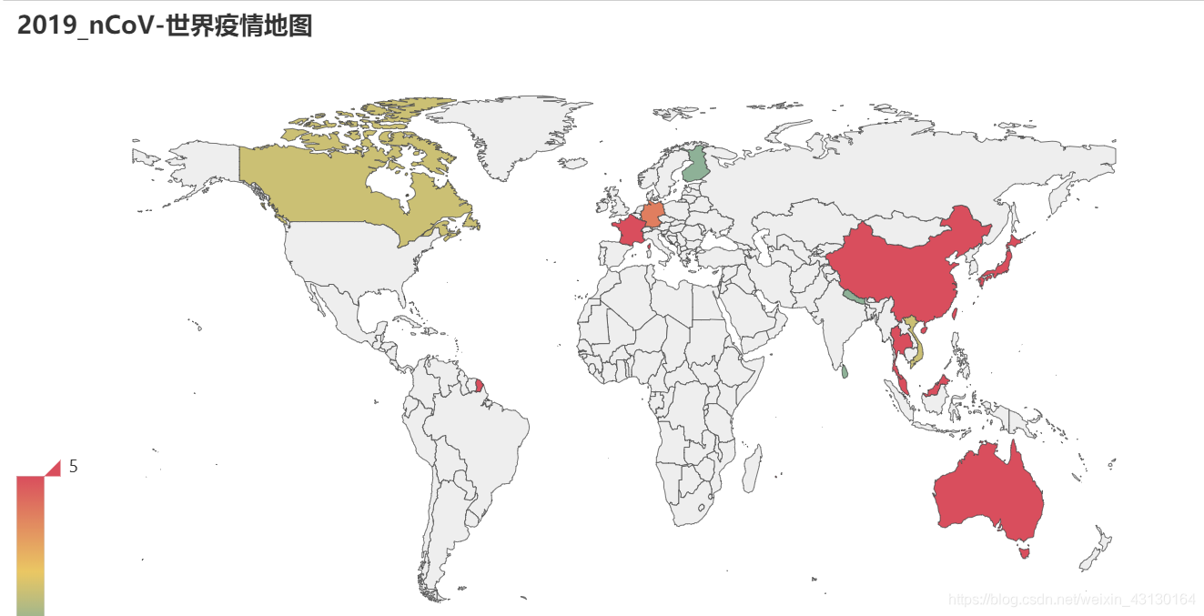
world_map = Map()
world_map.add("",[list(z)for
z inzip(list(world_data_["英文"]),list(world_data_["confirm"]))],"world",is_map_symbol_show=False)
world_map.set_global_opts(title_opts=opts.TitleOpts(title="2019_nCoV-世界疫情地图"),visualmap_opts=opts.VisualMapOpts(max_=5),legend_opts=opts.LegendOpts(is_show=False))
world_map.set_series_opts(label_opts=opts.LabelOpts(is_show=False))
world_map.render_notebook()
1
2
3
4
5
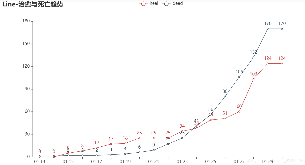
疫情趋势
抓取每日确诊数据
defcatch_daily():
url ='https://view.inews.qq.com/g2/getOnsInfo?name=wuwei_ww_cn_day_counts&callback=&_=%d'%int(time.time()*1000)
data = json.loads(requests.get(url=url).json()['data'])
data.sort(key=lambda x:x['date'])return data
line = Line()
line.add_xaxis(list(daily_data["date"]))
line.add_yaxis("heal",list(daily_data["heal"]))
line.add_yaxis("dead",list(daily_data["dead"]))
line.set_global_opts(title_opts=opts.TitleOpts(title="Line-治愈与死亡趋势"))
line.render_notebook()
1
2
3
4
5
6
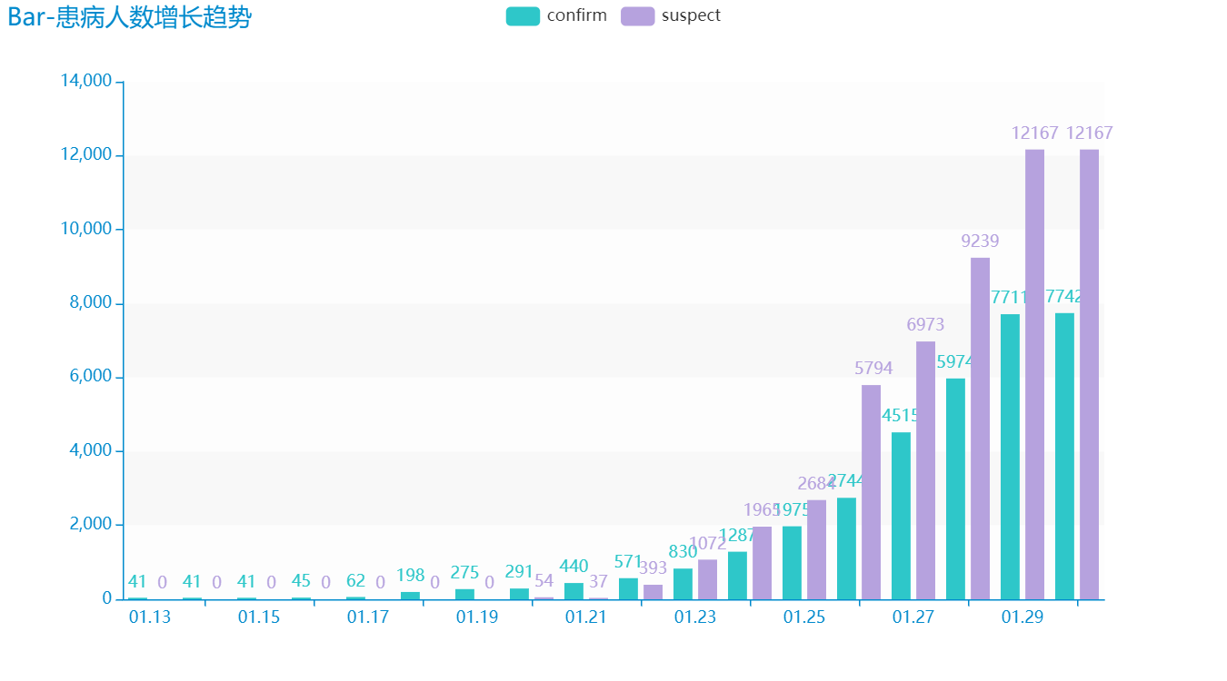
绘制每日确诊与疑似病例
defbar()-> Bar:
c =(
Bar({"theme": ThemeType.MACARONS}).add_xaxis(list(daily_data["date"])).add_yaxis("confirm",list(daily_data["confirm"])).add_yaxis("suspect",list(daily_data["suspect"])).set_global_opts(
title_opts={"text":"Bar-患病人数增长趋势"}))return c
bar().render_notebook()